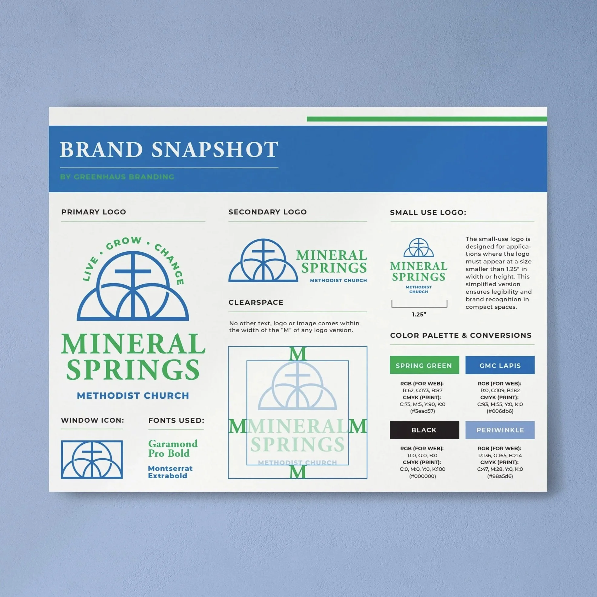
Meet the Client:
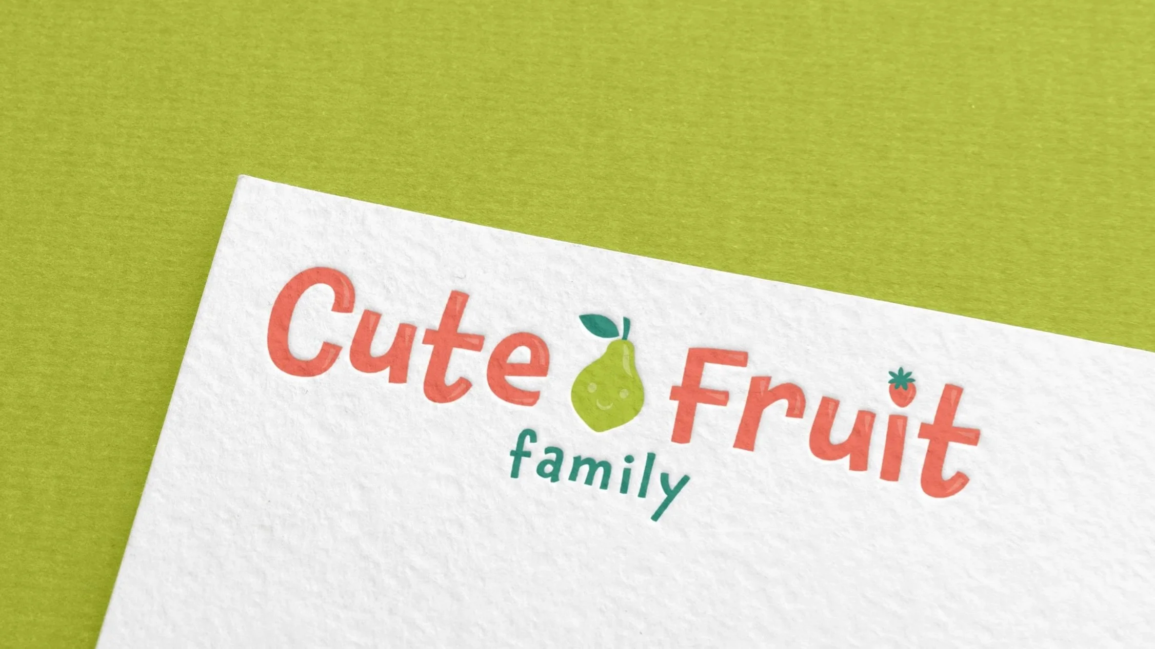
Cute Fruit Family is a new Christian devotional brand created by two sisters-in-law who co-authored Cute Fruit, a family devotional centered on the Fruit of the Spirit. Their prayer is that families will grow closer to Jesus and to each other through meaningful conversations and activities rooted in Scripture. As they prepared to launch their book, social media presence, and future products, they reached out for a cohesive logo that would bring all the moving pieces together.
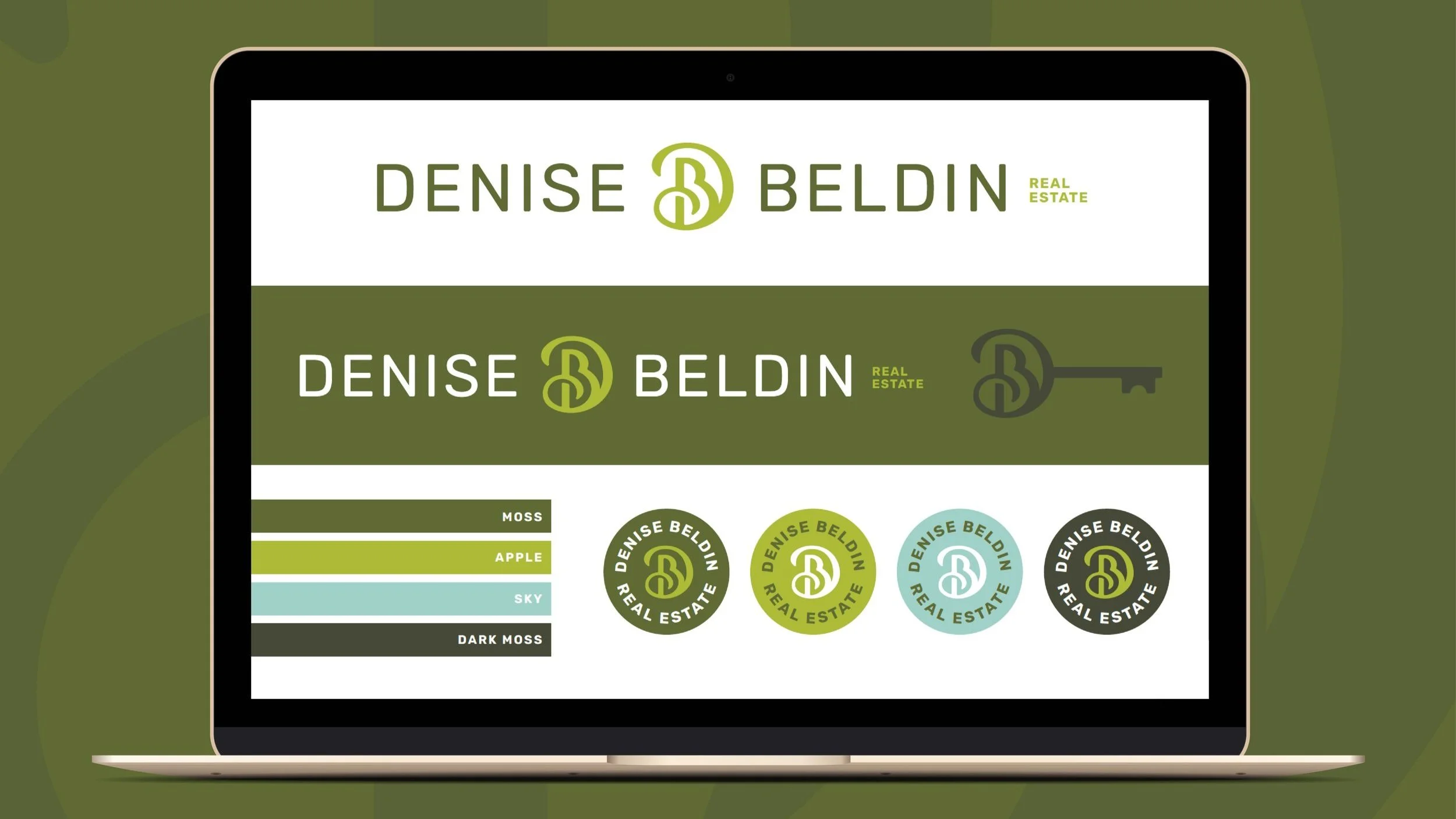
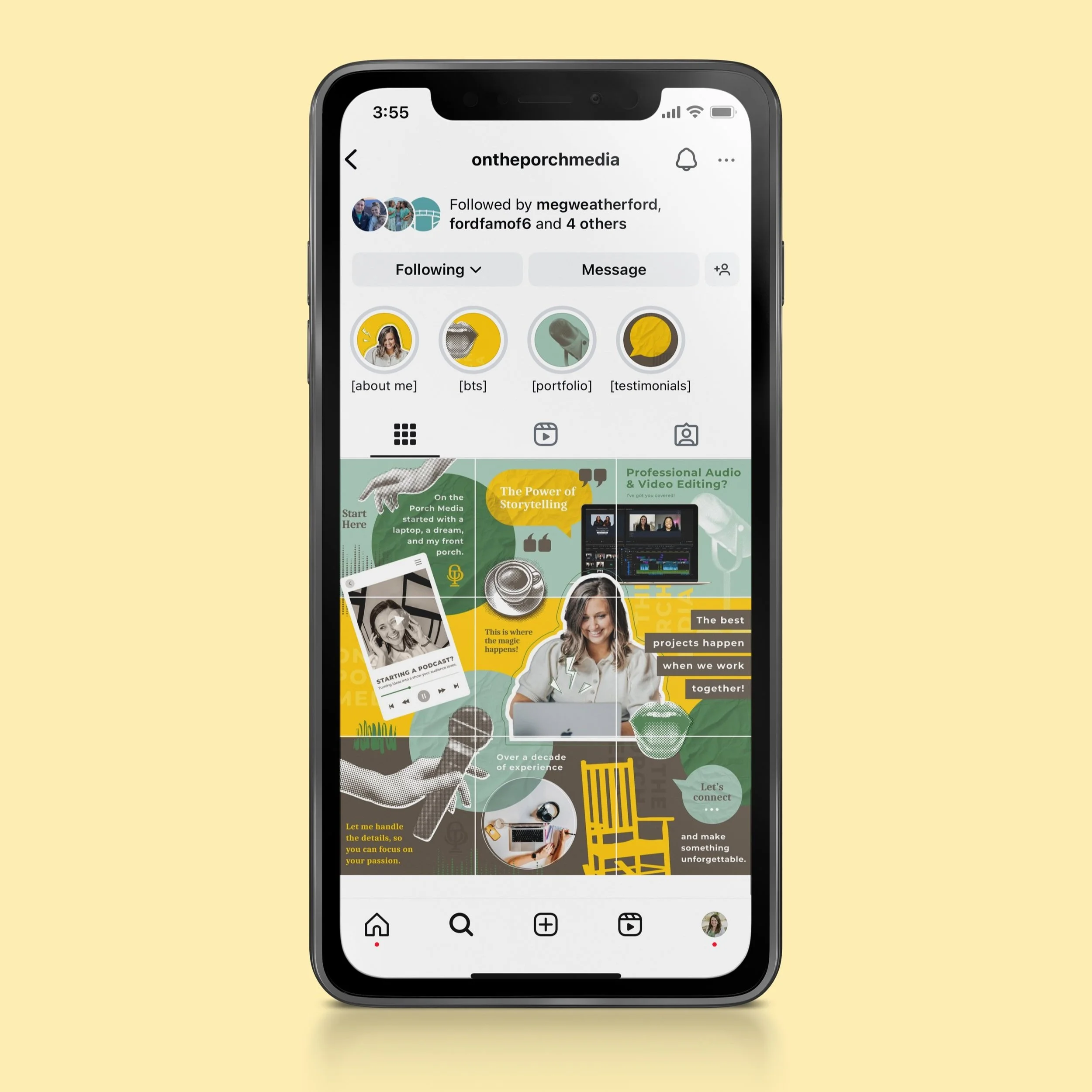
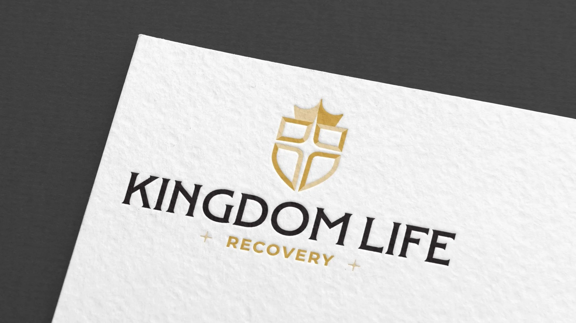
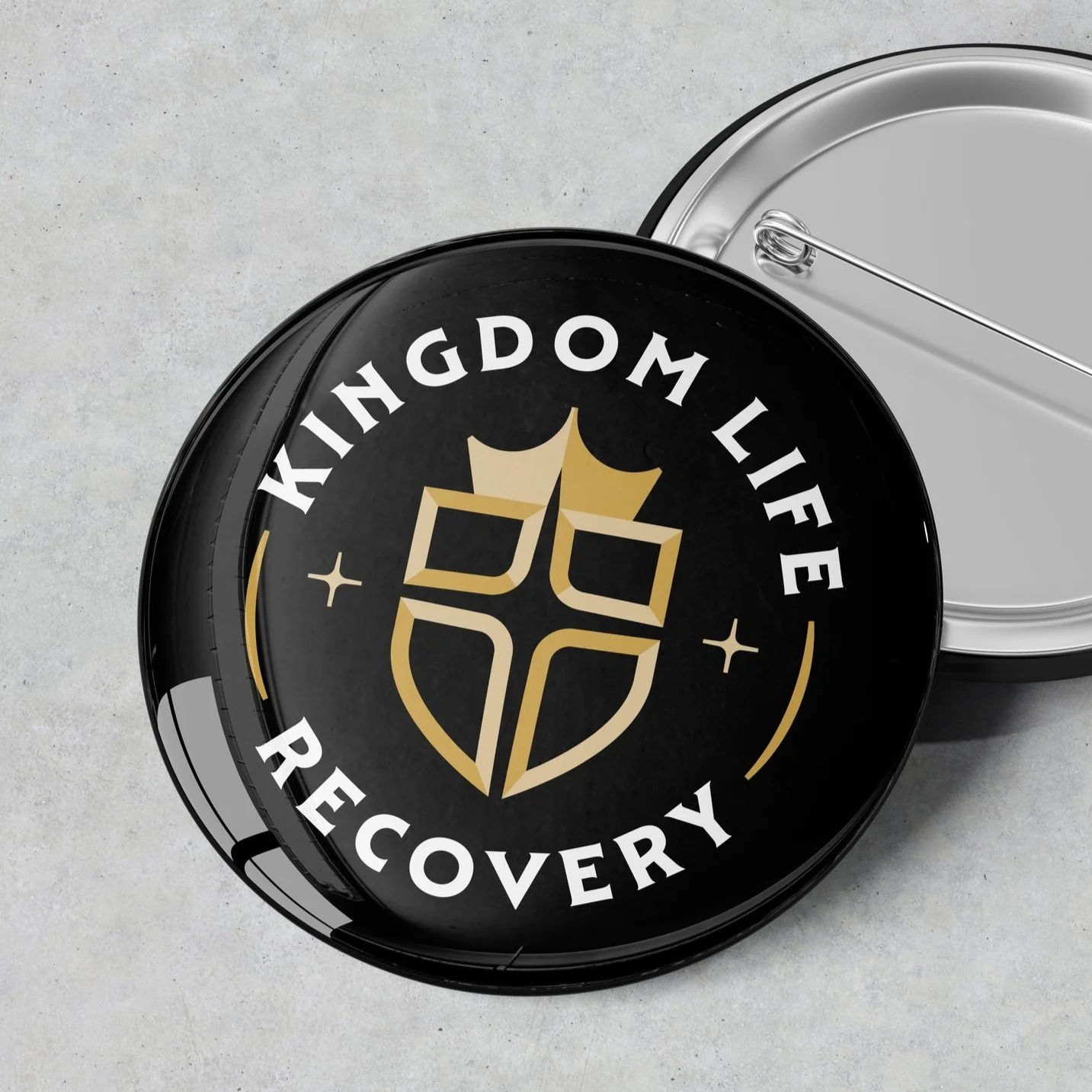
Project Overview:
Create a bright, uplifting logo that reflects the playful and meaningful heart of the Cute Fruit devotional.
Build the visual identity around the fruit illustrations featured on the book cover, ensuring everything feels connected and recognizable across the brand.
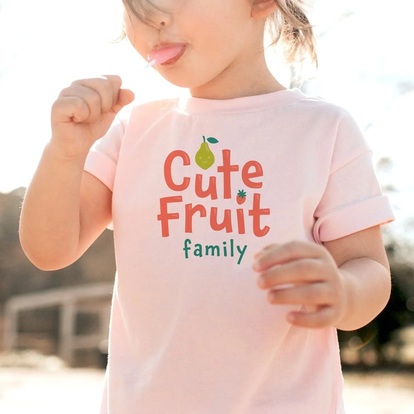
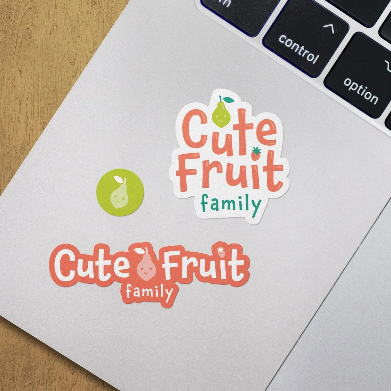
Deliver a flexible, easy-to-use mark that works for products, their website, and social media, supporting the growth of their new brand while honoring their initial budget as a startup.
Client Testimonial:
“Thank you so much!! You totally nailed our style and vibe. We absolutely love what you’ve created for Cute Fruit. It feels so “us,” and we love how your vision came together! Your work is just beautiful ~ thank you!” – Amy & Alex